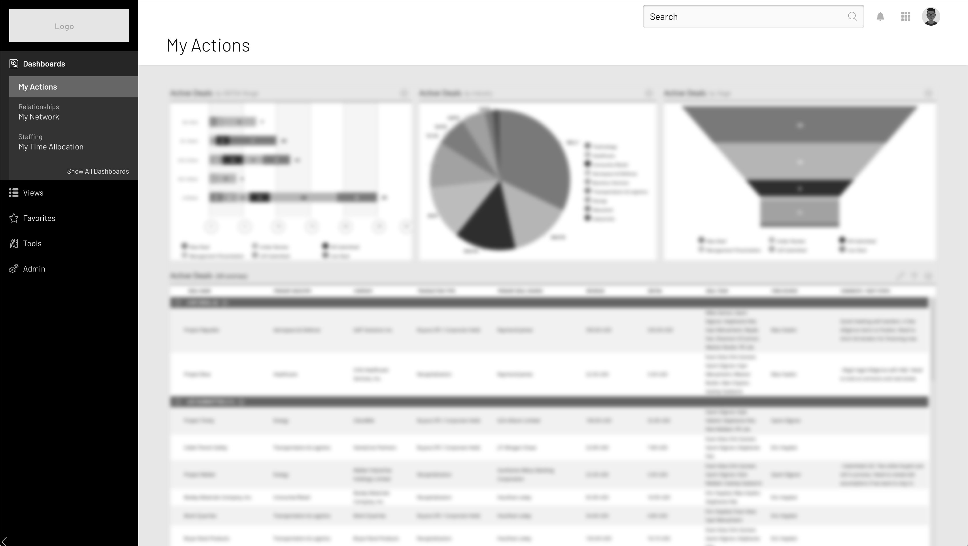
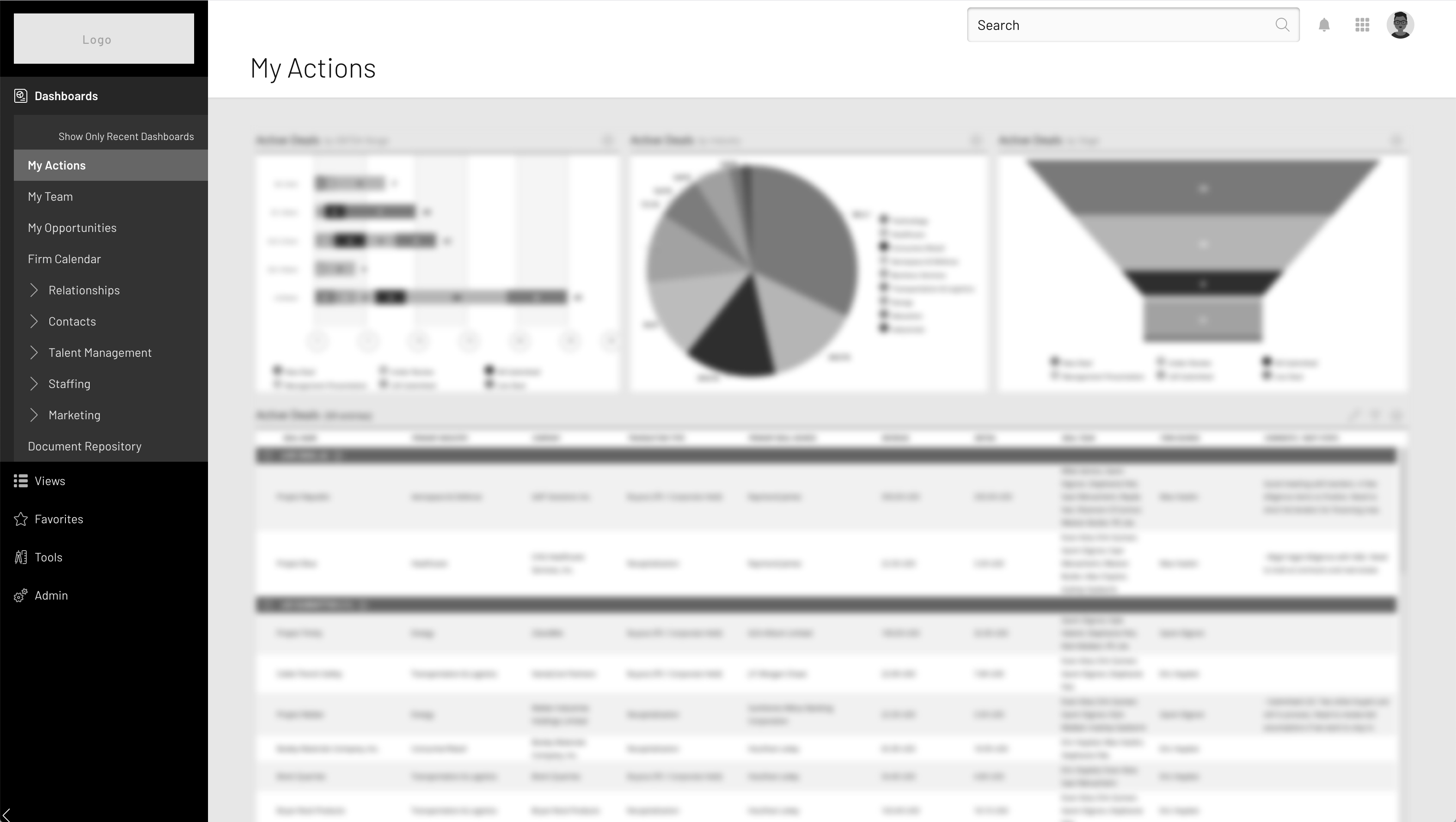
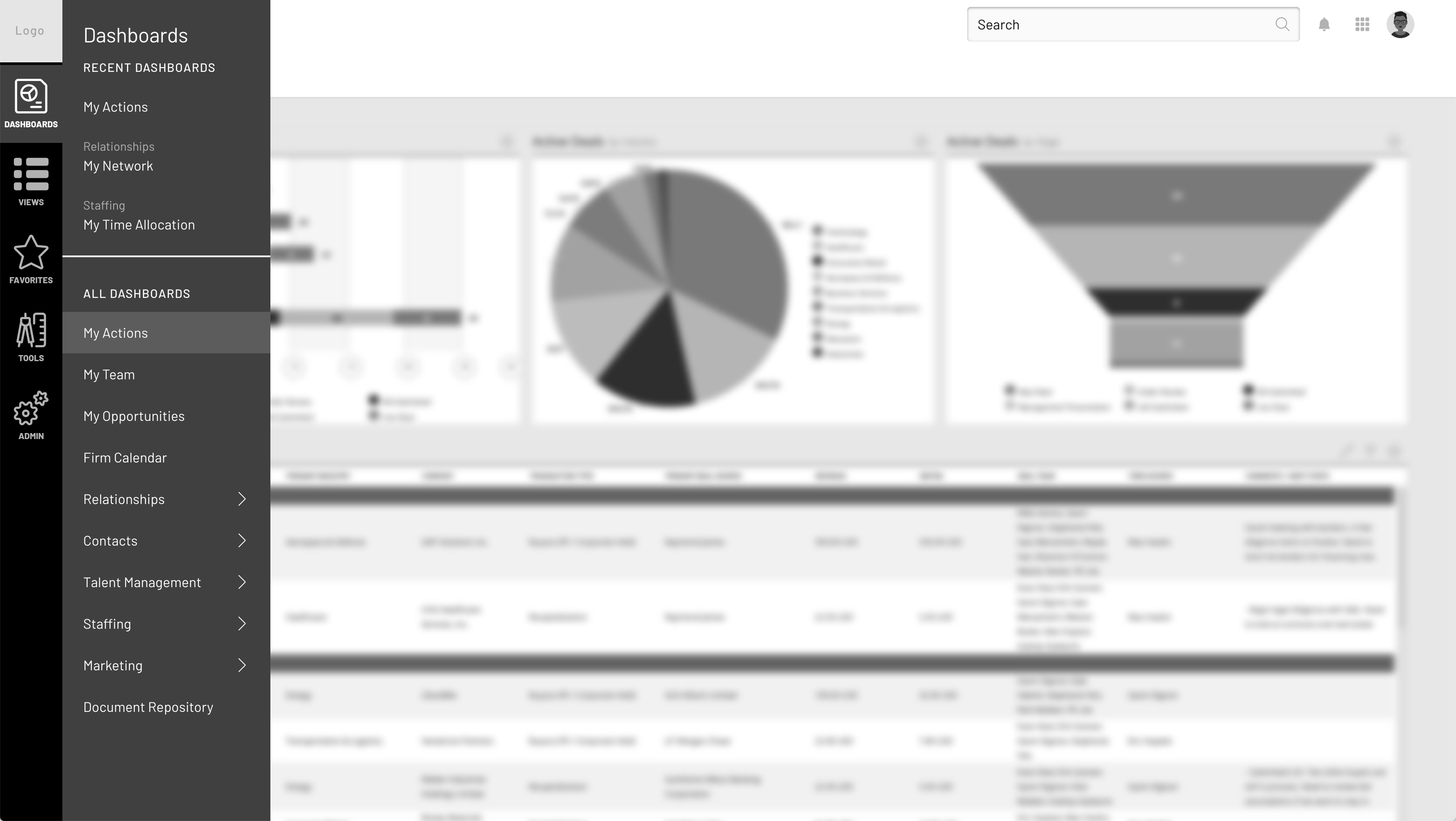
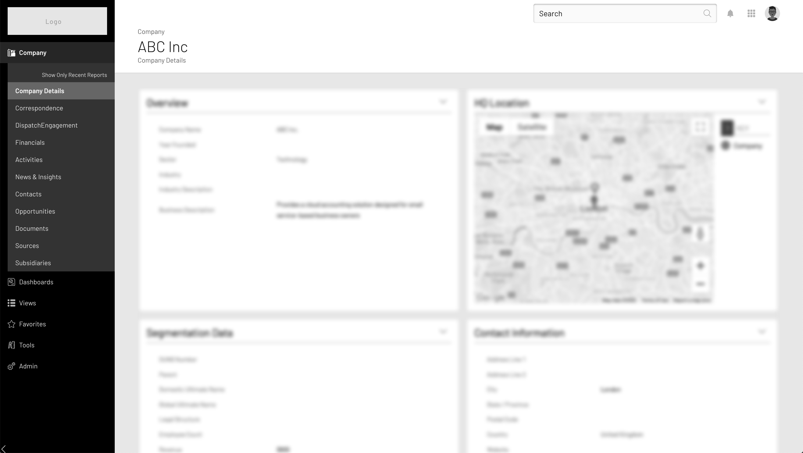
Business Impact
-
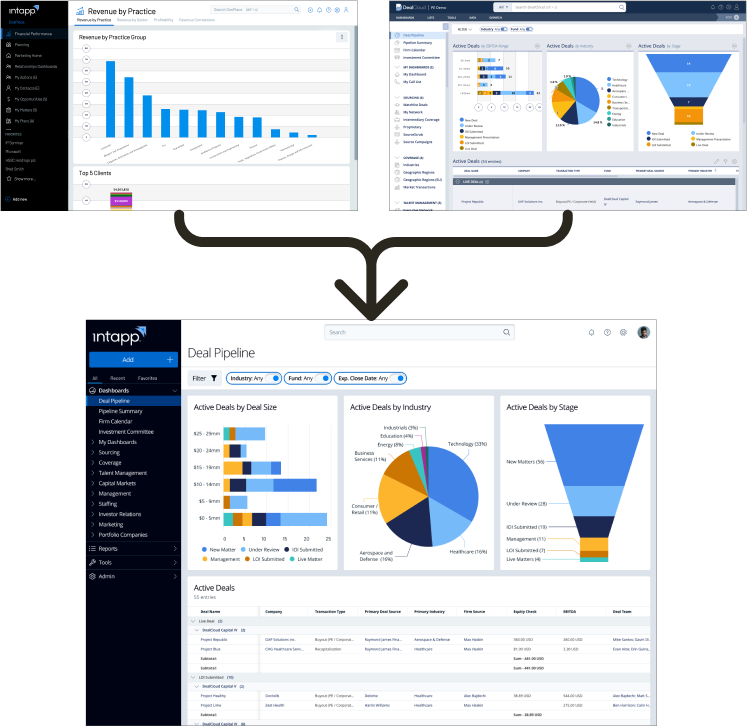
Merged 2 products together into a platform to increase operational efficiency.
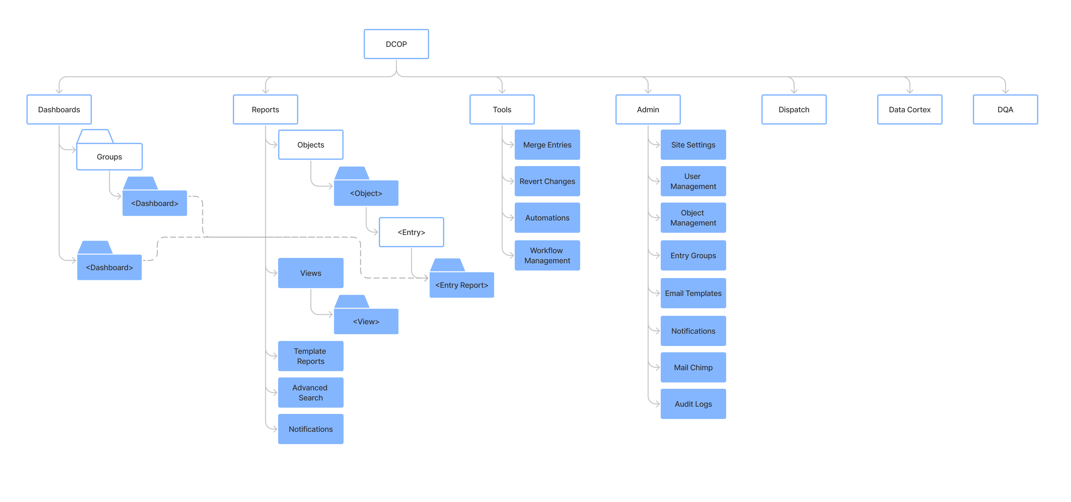
- Unified Navigation + Information Architecture
- Enable focus on a common UI
- Reduce Design, Development, and QA effort
-
Applied Intapp Design System to deliver a modern user interface.
- Iterated the design system where needed.
Background
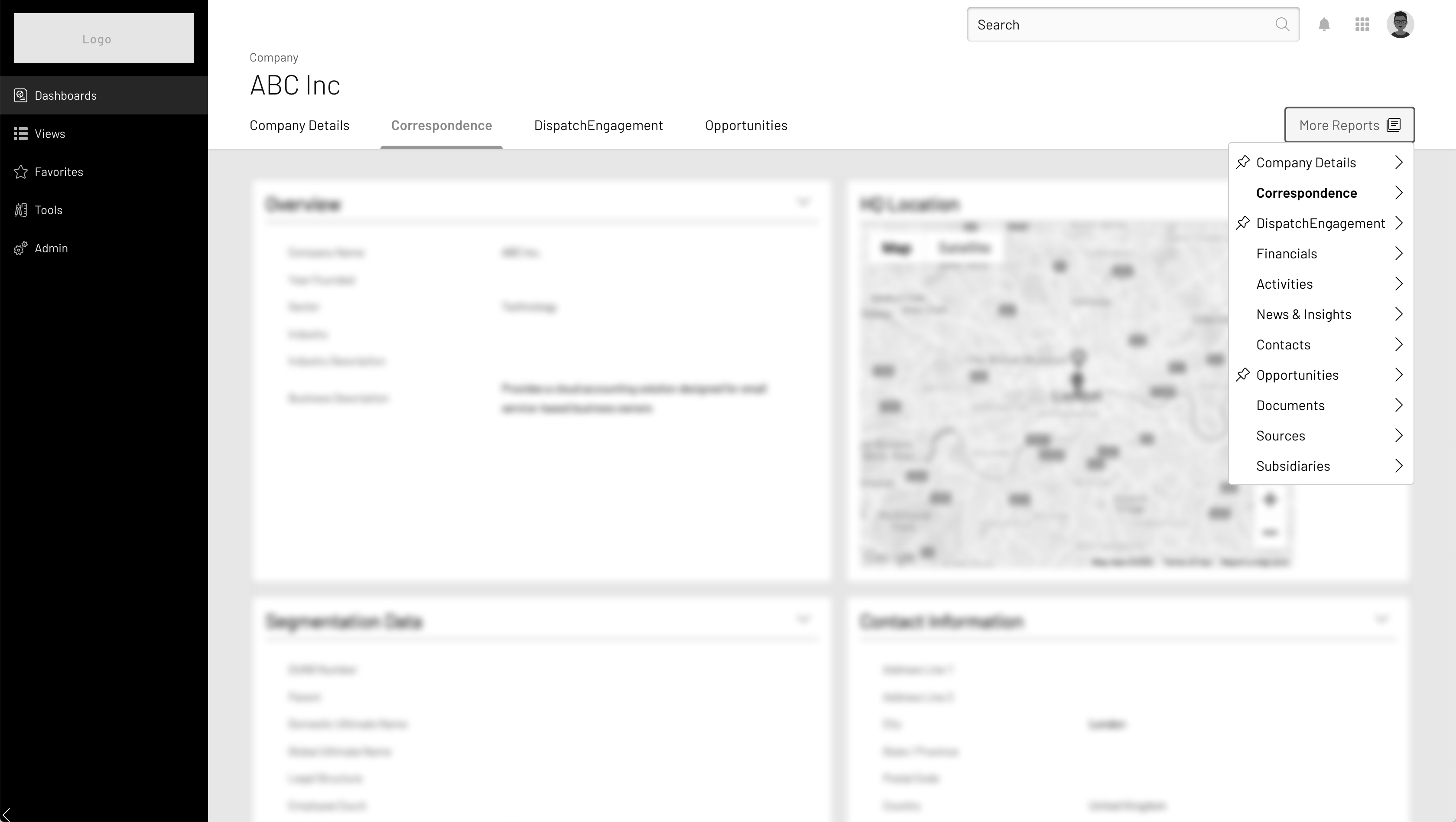
When Intapp acquired DealCloud (CRM for Private Capital & Investment Banking) in 2018 they made a fork of the product called OnePlace to serve the Legal & Professional Services Industries.
After 2.5 years we recognized that 2 versions of the same product created a lot of inefficiency across the board. However, by that time the 2 versions had developed in wildly different directions.
Challenges
-
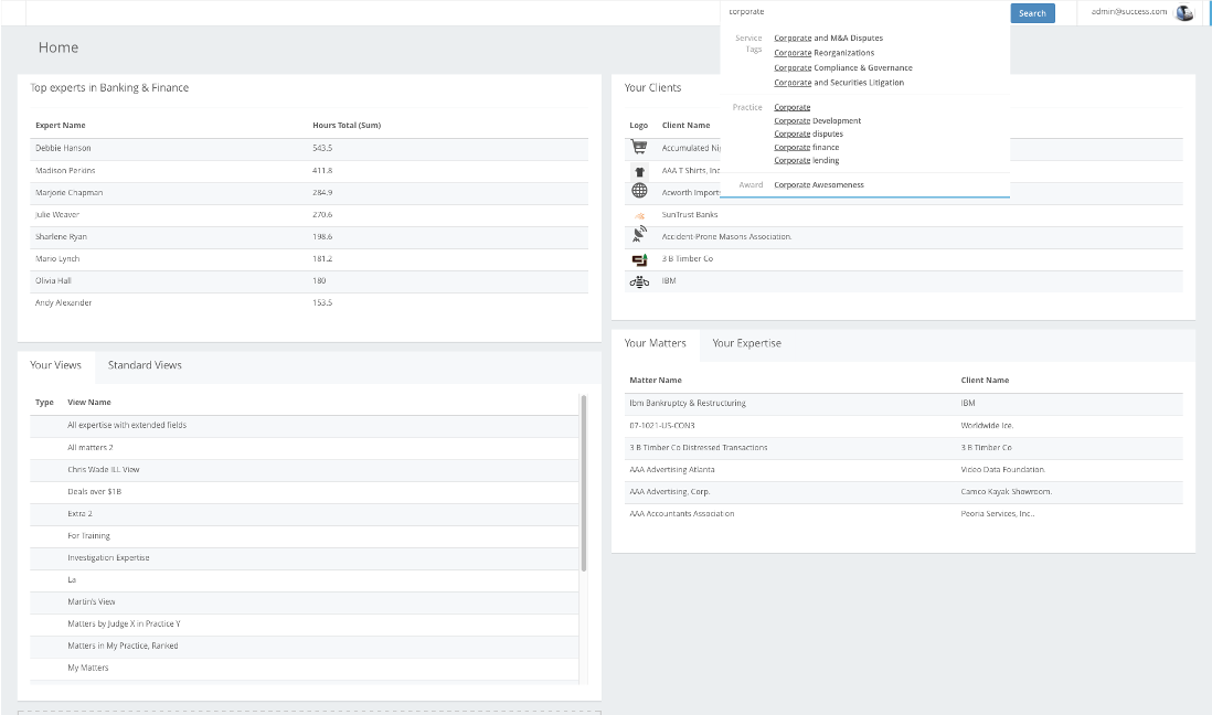
Very different UIs
- Users noted that DealCloud interface felt old & dated.
- Inconsistent interaction patterns
-
Needed to find way to continue to serve specific customer use cases with minimal disruption
- Unifying some patterns carried a lot of risk
- Large scale project required many hands (5 designers + 3 PMs) to accomplish. Coordination was key.
How
-
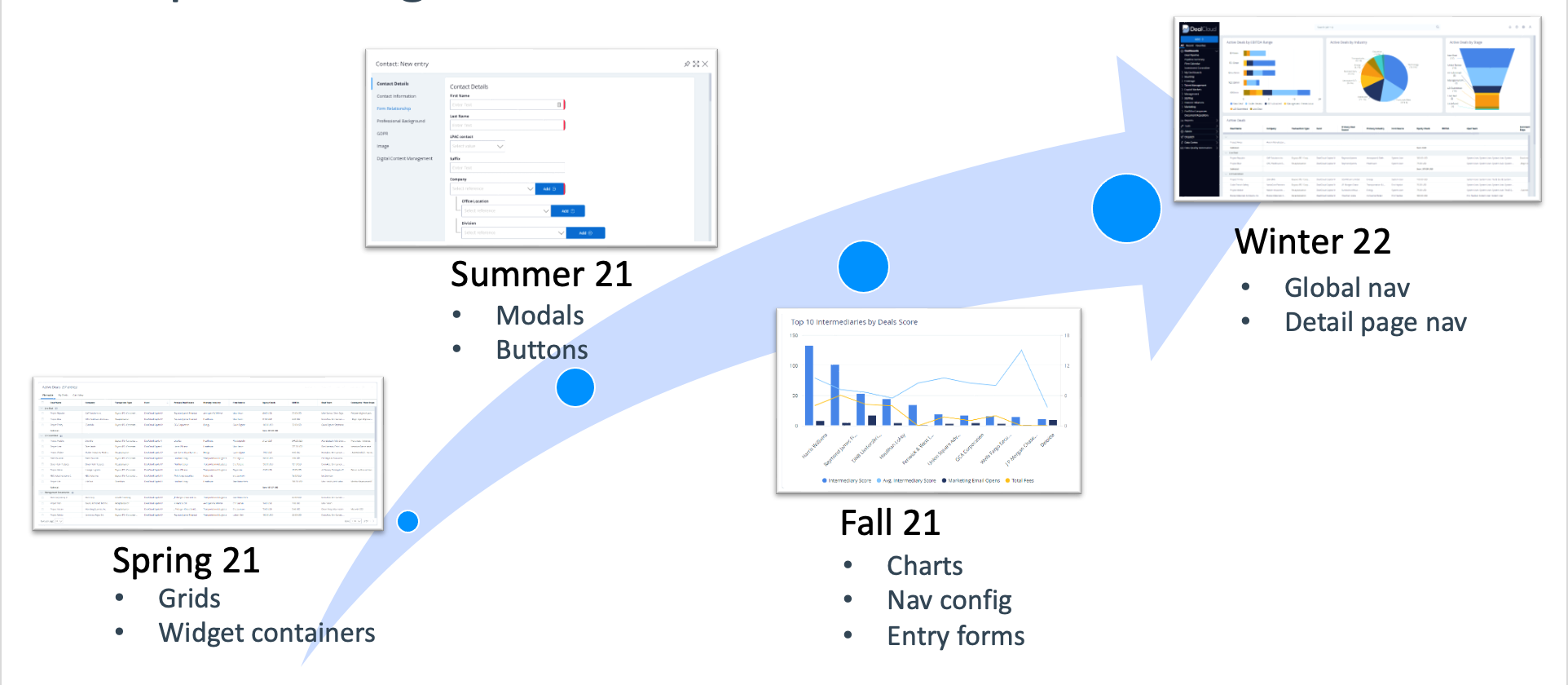
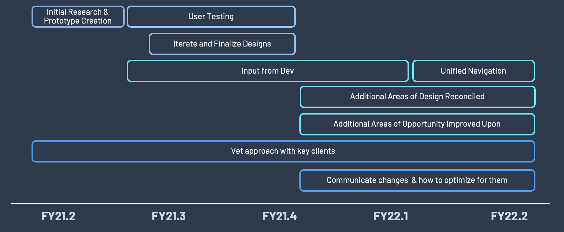
Phased approach
- Initially delivered unified designs for components that were functionally the same, but visually different
-
Ran multiple research sessions with users from both verticals on more complex & disparate elements to ensure we understood all considerations that needed to be made before implementing new designs.
- Validated new designs with those users using low & mid fidelity prototypes to be able to quickly and affordably work through multiple options.
-
Collaborated with director and PMs to manage project
- Distributed work among team of designers
- Personally handled Navigation